Tuesday, August 12, 2008

Five ways 3D experience makes your 2D artwork better

Really quick, here are five ways that experience in 3D modeling, animation, texturing, lighting and rendering can help you become a better 2D artist.


1. 3D modeling teaches you patience. Most people who draw could use more patience and attention to detail. 3D modeling teaches you to break a subject down to well-defined chunks and plan out your level of detail before you begin. In 2D mode, drawing on paper or tablet, I noticed that I tended to hurry through pieces and spend less time planning an entire scene (rather than just the foreground, for example) than I did in 3D.


2. Working in 3D teaches you not to be a technique nazi. At some point in creating your newest, awesome-est work, you realize that either a) you have no time to set up some incredible rendering technique, or b) the incredible rendering technique will take too long to render. You're forced to jury-rig a few things and make it happen. Even if the "happen" part means adding significant graphical elements in Photoshop. As a 2D artist, it's easy to look over at your newest mechanical pencil and dream about awesome mechanical drawings, but in reality, nothing is going to happen until some marking object - mechanical pencil or not - touches down on a piece of paper or your Cintiq screen.


3. Animation experience boosts your 2D visualization skills. Most 3D modelers will, at some point, start animating. 3D software just makes it so easy, you HAVE to try it. Once you've learned the basics of animation, you start to change camera POV, you notice how lighting changes how an object looks depending on its orientation, etc. This helps you understand a few key compositional principles, like a) some poses just look better than others, b) a changeup in lighting may really benefit your 2D art, and c) a feeling of depth created by POV/wide angle/narrow angle or even contrast variation adds visual interest.


4. You really learn what texture is. Most 2D artists struggle with this at first. They have pre-conceived notions of what texture is. Bricks look like perfect little red boxes, stacked together, with some pockmarks here and there. Skin is pink and maybe shiny in a dull kind of way. The sky is blue. 3D artists learn almost immediately that texturing is an abstract term comprised of some huge illustration principles, among other things. 3D artists also learn that bringing real-life textures into an image brings an element of chaos and random beauty that they might never think to express in a 2D drawing.


5. Expect more out of your medium. Working in 3D art taught me that there are so many features in 3D software, I could visualize just about anything I wanted to in breathtaking detail. But somehow, when I found myself holding a cracked, yellow pencil over a sheet of copy paper, the concept of "do ANYTHING you want!!!" didn't come naturally. Since then, I've learned that all of the concepts in 3D work - lighting, texturing, and even rendering and animation, still apply in 2D work. And darnit, even that little fact makes drawing things by hand more exciting.

Saturday, May 31, 2008

Creating Jordan's Avatar: 2


Here's the second version of Jordan's avatar. Whoa, big change. This one is a better fit and has less of an exaggerated look. It also took longer to make.


The first step was just to doodle until I came up with something that felt authentic. Then I made notes on the doodle for later. In fact, because of time constraints, I went ahead and ignored the notes. :)


My first pre-digital, post-sketch tactic was to establish a feel for the scene in my head. Based on that feeling, I knew I was going to need a green light in the background. It's weird how these things come to you! My 3D lighting experience really informed that decision, though.

To ensure that I didn't get derailed while working, I put the lighting cues into the scene first. They're just colored circles without any depth cues. My goal was not to be completely true to the lights (how annoying is it when people notice and make mention of that little fact?) but to let the lights have their place in the design. It's important to know which part of the spectrum you want to end up in.

So here's the pre-final with lighting cues (the final version is at the top of this post). There are some goofy curves and things, but overall the time spent was very effective. I think a large part of this was the help lent by lighting cues.

Thursday, May 15, 2008

Displacement, we love ye


Holy crow, you should see that video at 1280xwhatever. The visual energy is incredible.

So anyway, this demoscene compo entry sent me wandering through displacement-land to find a combination of procedural modules that create some fantastic, keyframe-able displacement effect.

For non 3D-ers: Displacement is the spiky things in that video doing the spiky bits where spikes jump out of the donut things.

I haven't found the displacement effect I want quite yet, but I found something else. I found an interest in animation that somebody left laying around. I haven't done animation much up to this point because I really wasn't into it. Yeah, making stuff move around, OK. But can I do it on my own terms? Can I do it in a way that supports real creative people, not just megacorps that sell creativity like it's something you place on your desk to stare at all day? Can I do it in high-res and spill it all over the internet?

Yep, OK, done. And I built it out of discarded e-trash using an over-scholarly manual written by a small group of bored 30-somethings from around the world. (Ouch, stop hitting me!)

So in short, expect to see more animation from me in the future. And no, that's not even close to saying "watch this space." Not even close. I would never say that to anybody I actually cared about.

Also, lately my students at Mendo College have been rocking. They rock so hard, one of them even brought me some guitar strings (no, really). I've seen them doing work that college students shouldn't be allowed to do. Like, genuinely GOOD design work. Another student just sent me a guide he made on constructing a fancy camera flash using metal mixing bowls. How is it that I get to hang around with cool people this much?

Also, you should read In the Sargasso Sea if you haven't had any nautical adventure in a while. Or if you like cats, boats, pirates, perfectly innocent protagonists with copious amounts of engineering knowledge, that sort of thing. Seaweed.

Saturday, April 26, 2008

HDR Exposure in Art of Illusion


Here's a render using the new HDR Exposure camera filter by "Jeremiah." I was amazed at how well the floor came out...without the filter installed, the floor was completely washed out and much of the orange was a bright yellow.

I am really, really, really glad for open source developers and plugin architectures at this point. :)

Also, I forgot I had put the Blue Screen of Death on the monitor in the scene...it was a funny surprise to render the image and see that.
Posted by Picasa

Friday, April 11, 2008

Creating Jordan's Avatar: 1


I'm really not sure what I would do without some sort of vector graphics editor on hand all the time. I have one on my USB disk, on my laptop, on my desktop. This makes it very easy to do mockups, quick cartoons, sketches, typography...all sorts of stuff. This week I did a quick sketch of a friend in manga style. He asked me to make an avatar of him, and this is the less-serious avatar version. His hands are posed like that because he's a programmer and he's typing at a keyboard. And in the back is the Japanese for "AAAAaaaaaa."


In other news, I'm back from Australia with lots of cool memories. It's been a while since I traveled outside of the U.S., so I tried hard to think of mementos that would actually mean something to me when I got home. For example, the boomerangs we bought mean mostly nothing to me. On the other hand, I bought as many different candy bars as I could, and I found a stationery store and bought some stationery to remind me of Australia. By "stationery," I mean "a few pens and a pencil case with a kangaroo on it." This is the sort of stuff I will actually consume/use, so my souvenir purchasing had much more meaning behind it. :-)


Posted by Picasa

Friday, March 7, 2008

Giving visual interest a boost


One cool thing about working in 3D is that it's a sort of hybrid between painting and photography. On the one hand, you can use as many "realistic" lighting scenarios you want; on the other, you can play with light in the most unrealistic, yet pleasing ways possible.

In the 3D world, there is a full spectrum of artists - those who want everything to look as it would from a camera, those who want everything to look as computer-generated as possible, those who want nothing more than a completely stylized, imaginary effect, and so on.

Regardless of the look you are after, the first step is to learn the tools. You can't really enforce a style without understanding how to express that style through your tools in *any* scenario your brain can think up.

So, my tip of the day for 3D artists is this: As you learn your 3D software, try as hard as you can to build up a visual toolkit of style and imagination that will pair nicely with your software-user skills. Put in that extra bit of energy to make an image into a story, or something that excites the mind.

When I look at the render above, I think of ways I could make it tell a story. There are countless ways - a handwritten letter, stained with blood, sitting opened on the table beneath the candle, that sort of thing - that require minimal effort compared to the potential increase in interest.

Posted by Picasa

Wednesday, March 5, 2008

Design Rotisserie


Here's an image I've been working on in GIMP, just to make sure my skills don't get rusty.


Occasionally somebody will ask me when I'm going to finish a hobby project that they're interested in. The way it works is, I have a rotisserie of hobby projects in my head. One weekend I'll grab a few minutes to work on Project A from 5 years ago, and the next weekend I'll work on Project B from a brainstorming session a day earlier.


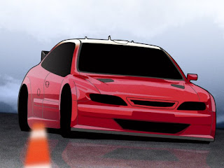
Above you'll see an example of a vehicle rendering that is unfinished. I really like how it looks in its unfinished state, but eventually I'll finish it up. There's an in-progress shot of it available too. I used GIMP to create it...there are some things I really like about GIMP (GNU Image Manipulation Program), the path tool being one of them. It's quite simple to use if you've worked with beziers before.

Posted by Picasa

Sunday, March 2, 2008

Camera play


Playing with my old Canon A80 today before the new camera arrives. I've taken some pictures I'm really proud of with the A80 - a couple of my Point Cabrillo photos, for example. The combination of manual controls with point-and-shoot simplicity have allowed me to explore cameras to the point where I feel comfortable ordering a DSLR for more serious use. The camera doesn't make the photographer, but a DSLR will give versatility we haven't had before. Also, I'm dying to use the fisheye lens to do some panoramas.

Camera work inspires me to turn back to 3D rendering with more creativity and a focus on unique lighting rigs, things like that. 3D work inspires me to look for the ideal lighting situations when I'm out and about with a camera.

Posted by Picasa

Thursday, February 28, 2008

The sustainable graphics toolchain


Every day I'm a bit more overwhelmed at the abundance of graphics tools that are waiting to line up and take their place in my graphics toolchain. I now have more graphics software installed on my computers than I believe I ever had, and every single title has some unique purpose.

The most exciting part of this is the fact that I get to choose the tools I use - that's one of the advantages to owning a business.

I decided early on that I wanted to use sustainable, open source software for my business, whenever possible. First, many of my clients are very sustainability-minded and they know the danger of using "proprietary," "temporary," and "short-term" solutions. Using sustainable software makes sense to them - I like how they think. Second, why would anybody running a business tie himself to proprietary software, unless it was absolutely unavoidable? I'm lucky enough to be able to use sustainable software most of the time without running into trouble. When the city I live in commissioned the 3D model you see above (the example you see has had a complete texture overhaul, but the model's the same), did they know it was made with sustainable software? No. Do they care? Doubt it. But I am happy that there's no license that will ever lapse and lock up that artwork on my hard drive, keeping me from improving on it. There's no chance that the software developer will abandon the software that made the artwork, keeping it locked up, out of distribution, and unsupported.

My final reason for being picky about the software is the most fun: I get to be as involved as I like in the software development process. Looking at the image above, there is one HUGE feature used in its creation that I had suggested to the software developer. He implemented the feature, I created the artwork, and now I feel really glad I got involved in the software development process (as small as my role may be). I've even had people send me re-compiled, upgraded versions of the software when they noticed I asked for a specific feature that I couldn't do without on a big project. Impossible to do with proprietary software.

Posted by Picasa

Wednesday, February 27, 2008

Time for a Story


There is a small island off the west coast of the United States that has an interesting past. The island was grown synthetically as a result of a Department of Defence research project that started in 1962. Parts of the island are apparently still growing in beautiful fractal patterns beneath the surface. You could put on some diving tanks and check it out for yourself, if anyone knew where the island was located. The island has been scrubbed from satellite photography as well as geographical charts and maps, and a sensor suite warns approaching ships away by radio long before they come within sight of it.

In October 2003, a survey group from a coastal survey ship, riding in a small boat with no radio, landed on the island to have a look around. Three of the four men on the boat just...disappeared. Nobody's sure what happened to them. The fourth man, the junior of the group, survived, having returned to his ship alone and quite frightened. He left his surveying position in 2004 and has written about his experiences from time to time.

I have access to this survivor's journal, and a particular sketch of his has intrigued me ever since I first saw it. I knew I had to recreate the horrible mood in 3D as soon as I saw the sketch.

OK, not really. In fact, there is no island. But I do like the way this image turned out - it does tell a story.

Posted by Picasa

Saturday, February 23, 2008

Metal Caustics


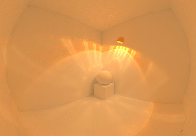
One day I went to a nice department store and I found myself looking at the really nice effect created by little lamps in different locations around the store. One of those effects was a caustic that was created by the light hitting the inside of the metal casing and bouncing off, creating a pretty effect on nearby walls. I realized I had never tried this before in 3D so I went home and ended up with this result. The renderer was fairly picky about the circumstances under which it was going to create this look, but with some trial and error it turned out just as I wanted it to.


While the effect is pretty expensive, requiring a lot of processing time to create, it's fun to play around with.

Posted by Picasa

Friday, February 22, 2008

I'm tired already

Tons of work ahead today...todos coming in from all over...

Update: Actually it went really well, although I got hyper-focused and I went for about 7 hours at one point without taking any breaks. I noticed I didn't drink any water or nibble on anything during that time. Yikes.

Posted by Picasa

Thursday, February 21, 2008

The demoscene just keeps giving and giving

It seems like every time I stumble across a musician I really like, they turn out to be an ex-tracker. I used to wonder where it was all going to lead, all this stuff in MOD and XM format, sounding great but so annoying to copy to a cassette tape for walkman use :)

Subliminal Doodling


Back when I thought my Art of Illusion habit was going put me into an addiction treatment center. :-)
Posted by Picasa

Ball Chair in 3D


The ball chair with fun-to-play-with little emissive globes.
Posted by Picasa

3D Float plane over clouds


Clouds test. Turned out a lot better than I originally thought (I was mad because the shadow on the clouds was nowhere to be found, but it was just a refinement problem).

The secret to getting a nice chrome effect is creating the proper environment to reflect; it's not enough just to say, "ok, texture, you're going to be reflective." When chrome (or any really shiny surface) doesn't have anything pretty to reflect, it doesn't really give what the mind recognizes as the chrome effect.


Posted by Picasa

Splash Screen for Freemind Software


An old (2004?) Freemind splash mockup. First use of 3D for a splash, and a lot of fun to make those rocks.
Posted by Picasa

Discovery One


Totally.
Posted by Picasa

"Greeble" Modeled in 3D


Ahhh, greeble. Every 3D modeler should make at least one greeble scene. I noticed that some contrast between non-greebled objects and greebled objects should be present for an extra little eye-catching effect.


Posted by Picasa

Glass Textures


Glass textures meant to be used without materials for the most part. I was pretty surprised at the outcome - a lot of these have become very versatile and will stay in my collection permanently.
Posted by Picasa

Red Mars with water


An older 3D render of Mars in semi-terraformed state. I'll probably still use this in a still composition at some point.

Posted by Picasa

Related Posts