Sunday, June 14, 2009

New Old Software: GrafX2, Compact, Cross-Platform, and Old School

It seems like every step we take into the future brings us reminders that even old things, well designed, are still useful and even exciting. GrafX2 seems to be a good example of how this works in the software world.

Grafx2, originally distributed as freeware in 1996, was a widely-used graphics-editing program in the demoscene. Here's how it looks:


Okay, so I didn't create the music studio graphic in GrafX2. It's from MS Paint, but I do wish I had the neat tools in Grafx2 when I created it.

Anyway, being open source, the software is still under development, with a very recent release ready to be downloaded. And that's pretty darn cool.

Grafx2 is an old-school graphics software package with personality and some serious power when it comes to manipulating raw pixels. Pixel artists need to be able to do some amazing stuff, often interpolating by hand in areas where even some of the best computer algorithms would fall short.

Here are some of the bits that I like about Grafx2:

1) The famous "gradient circles" tool (not sure why, but I love how it works. Draw the circle, then click inside the circle where you want the start of the gradient to be)

2) You are limited to 256 colors. My computer graphics students know that I love to drone on and on about constraints, but really, you need to know that in a 16.5 million (and more) color world of Photoshops and Painters and whatnot, one of the best creative things you can do is back up, choose a palette of 256 colors, (or hey, even 8 or 16!) and get workin'. No complaints, just do it, and see what happens. Can you be just as creative with these limitations, or do you need to be schooled some more?

3) Terminology like "oops," (undo) "zap"/"kill" (delete); an interface font choice of "fun" or "classic," all the great little bits that give the software some personality. Where is that personality in Photoshop? Answer: Sorry, we're afraid that using "kill" may offend your boss...you know, the one with the purchasing power.

4) It started as freeware, which is cool, but sort of scary to use - who knows when it's going to go commercial or just disappear, right? But the developers decided to release it as open source software! The sky's the limit. Grab it, take it apart, add more fun terminology, and use your remix. Or submit your ideas to the developers and see if they go prime-time.

If you are in the market for pixel-art editors, you might also want to check out MT Paint and KolourPaint as well. I like them both in different ways.

Note that Grafx2 is not super-easy for beginners. The learning curve isn't what I'd call super-steep, but pay attention to the "?" button on the toolbar for help and browse the manual for more information.

By the way, Ubuntu users: If you are using Ubuntu 9.04, you can go to the Launchpad download page for 9.10 and install the .deb file. It will work with 9.04/Jaunty just fine. Here are the steps:

1) Go to the link above, then "Build", then click "Karmic i386" (or whatever platform you have...most are i386)

2) That takes you to this page (for i386 only) where you can click "Resulting binaries" in the right-side column.

3) Then you'll be taken to a page with a link to download the .deb file. Download and double-click it to install.

Have fun!

Overview: Split Image Script for GIMP

GandalftheGray, the contributor responsible for another script I reviewed, also created a script called Split Image. (Yo Gandalf, the link on your user page is broken)

What does it do? Simple: It divides your image into tiles, and puts each tile on its own layer.

Be warned though: This script will not function without the "Paste as New Layer" script installed.

The scripts appear on the GIMP "Layer" menu. Here is an overview of the "Split from Rectangle" option:


...And here is an overview of the "Split from Matrix" option:


Here are their two interfaces...pretty simple:

Rectangle:


Matrix:


I'm trying to imagine what use someone would get out of this script, but I don't have any ideas. Anybody?

Saturday, June 13, 2009

Overview: Visibility Manager Script for GIMP

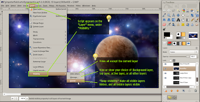
If you work with layers a lot, you might like the recently-uploaded Visibility Manager script. This GIMP script offers useful functionality like hide all except the current layer and swap visible layers (making visible layers invisible and vice-versa).

Click the image below to see an annotated screenshot-overview:


If you pair it with GIMP's Dynamic Keyboard Shortcuts, this could be a very handy tool. However, if you don't work with a lot of layers very often, you might not see the point.

As always, Linux users should save this script in their GIMP scripts folder to install it.

Thursday, June 11, 2009

Overview: Sample Average Color for GIMP

I was interested to see a "Sample Average Color" GIMP script appear at the repository. The image below is a rundown of how it works. To install it in Linux, drop the .scm file in your ~/.gimp-2.6/scripts folder.


This script may be helpful to some; people who have taken my computer graphics classes may recall that there is a similar, and quite comprehensive tool online at colr.org. More tools are listed at the color tools section of the Art 86 website.

Eliteness note: Yes, I taught Photoshop and other Adobe products to college students, and I enjoyed it. And I do use GIMP too! Don't be afraid to add new tools to your arsenal - learn their strengths and weaknesses. GIMP is especially handy now that my creative workflow has gone entirely Linux-based due to buggy software. There are some really nice third-party plug-ins and scripts available for GIMP, too.

Friday, June 5, 2009

Wallpaper-tray vs. Drapes

Short version: Wallpaper-tray wins.

I was looking for a wallpaper-rotator for my desktop. Man, how spoiled we are! Anyway, looking through Add/Remove Programs in Ubuntu, I found that I had a mystery-meat choice: Wallpaper-tray or Drapes. So I installed both, tasted the mystery meats, and here's what I found.

Wallpaper-tray (hereafter WT) shows a thumbnail of the current wallpaper on your panel. I really like this touch. Drapes does not seem to do this.

WT lets you do an instant search if you know you have a wallpaper image with a certain word in the title; Drapes has no search.

WT expects you to know what wallpapers you want ahead of time, and you put them in a folder. Drapes sort of does this odd abuse-of-checkboxes thing where you're "able" to pick which ones you really want or don't want to show through the Drapes interface. It didn't really work for me.

WT seems to have more options overall, though. It's sort of like more options + sane defauts. In WT, a single click on the icon changes the wallpaper. In Drapes, you double-click.

Overall, Wallpaper-tray seems a better fit to me. More polished. Looks cooler in the panel, too. Drapes will work in a pinch, but man, those checkboxes bug me.

Monday, May 11, 2009

End of the Semester - Wow, that was Fast


One of my students, Morgan Rex, gave this puzzle to me. He designed it, and he was selling them for a while. I think it's one of the coolest wooden puzzles I've seen.

I've had some really, really awesome students since I started teaching at Mendocino College. This is my last semester teaching there, but I'll be leaving with treasured memories of the time I spent teaching computer graphics. Major thanks go to Paula Gray for extending the initial invitation to me.

Friday, May 8, 2009

Beautiful weather
People need to warn me when they're gonna do things.

Wednesday, May 6, 2009

"FireClosesTempTabs just closed 42 tabs that you probably won't refer to again." Someone please make this extension. :-)

Tuesday, August 12, 2008

Five ways 3D experience makes your 2D artwork better

Really quick, here are five ways that experience in 3D modeling, animation, texturing, lighting and rendering can help you become a better 2D artist.


1. 3D modeling teaches you patience. Most people who draw could use more patience and attention to detail. 3D modeling teaches you to break a subject down to well-defined chunks and plan out your level of detail before you begin. In 2D mode, drawing on paper or tablet, I noticed that I tended to hurry through pieces and spend less time planning an entire scene (rather than just the foreground, for example) than I did in 3D.


2. Working in 3D teaches you not to be a technique nazi. At some point in creating your newest, awesome-est work, you realize that either a) you have no time to set up some incredible rendering technique, or b) the incredible rendering technique will take too long to render. You're forced to jury-rig a few things and make it happen. Even if the "happen" part means adding significant graphical elements in Photoshop. As a 2D artist, it's easy to look over at your newest mechanical pencil and dream about awesome mechanical drawings, but in reality, nothing is going to happen until some marking object - mechanical pencil or not - touches down on a piece of paper or your Cintiq screen.


3. Animation experience boosts your 2D visualization skills. Most 3D modelers will, at some point, start animating. 3D software just makes it so easy, you HAVE to try it. Once you've learned the basics of animation, you start to change camera POV, you notice how lighting changes how an object looks depending on its orientation, etc. This helps you understand a few key compositional principles, like a) some poses just look better than others, b) a changeup in lighting may really benefit your 2D art, and c) a feeling of depth created by POV/wide angle/narrow angle or even contrast variation adds visual interest.


4. You really learn what texture is. Most 2D artists struggle with this at first. They have pre-conceived notions of what texture is. Bricks look like perfect little red boxes, stacked together, with some pockmarks here and there. Skin is pink and maybe shiny in a dull kind of way. The sky is blue. 3D artists learn almost immediately that texturing is an abstract term comprised of some huge illustration principles, among other things. 3D artists also learn that bringing real-life textures into an image brings an element of chaos and random beauty that they might never think to express in a 2D drawing.


5. Expect more out of your medium. Working in 3D art taught me that there are so many features in 3D software, I could visualize just about anything I wanted to in breathtaking detail. But somehow, when I found myself holding a cracked, yellow pencil over a sheet of copy paper, the concept of "do ANYTHING you want!!!" didn't come naturally. Since then, I've learned that all of the concepts in 3D work - lighting, texturing, and even rendering and animation, still apply in 2D work. And darnit, even that little fact makes drawing things by hand more exciting.

Saturday, May 31, 2008

Creating Jordan's Avatar: 2


Here's the second version of Jordan's avatar. Whoa, big change. This one is a better fit and has less of an exaggerated look. It also took longer to make.


The first step was just to doodle until I came up with something that felt authentic. Then I made notes on the doodle for later. In fact, because of time constraints, I went ahead and ignored the notes. :)


My first pre-digital, post-sketch tactic was to establish a feel for the scene in my head. Based on that feeling, I knew I was going to need a green light in the background. It's weird how these things come to you! My 3D lighting experience really informed that decision, though.

To ensure that I didn't get derailed while working, I put the lighting cues into the scene first. They're just colored circles without any depth cues. My goal was not to be completely true to the lights (how annoying is it when people notice and make mention of that little fact?) but to let the lights have their place in the design. It's important to know which part of the spectrum you want to end up in.

So here's the pre-final with lighting cues (the final version is at the top of this post). There are some goofy curves and things, but overall the time spent was very effective. I think a large part of this was the help lent by lighting cues.

Thursday, May 15, 2008

Displacement, we love ye


Holy crow, you should see that video at 1280xwhatever. The visual energy is incredible.

So anyway, this demoscene compo entry sent me wandering through displacement-land to find a combination of procedural modules that create some fantastic, keyframe-able displacement effect.

For non 3D-ers: Displacement is the spiky things in that video doing the spiky bits where spikes jump out of the donut things.

I haven't found the displacement effect I want quite yet, but I found something else. I found an interest in animation that somebody left laying around. I haven't done animation much up to this point because I really wasn't into it. Yeah, making stuff move around, OK. But can I do it on my own terms? Can I do it in a way that supports real creative people, not just megacorps that sell creativity like it's something you place on your desk to stare at all day? Can I do it in high-res and spill it all over the internet?

Yep, OK, done. And I built it out of discarded e-trash using an over-scholarly manual written by a small group of bored 30-somethings from around the world. (Ouch, stop hitting me!)

So in short, expect to see more animation from me in the future. And no, that's not even close to saying "watch this space." Not even close. I would never say that to anybody I actually cared about.

Also, lately my students at Mendo College have been rocking. They rock so hard, one of them even brought me some guitar strings (no, really). I've seen them doing work that college students shouldn't be allowed to do. Like, genuinely GOOD design work. Another student just sent me a guide he made on constructing a fancy camera flash using metal mixing bowls. How is it that I get to hang around with cool people this much?

Also, you should read In the Sargasso Sea if you haven't had any nautical adventure in a while. Or if you like cats, boats, pirates, perfectly innocent protagonists with copious amounts of engineering knowledge, that sort of thing. Seaweed.

Saturday, April 26, 2008

HDR Exposure in Art of Illusion


Here's a render using the new HDR Exposure camera filter by "Jeremiah." I was amazed at how well the floor came out...without the filter installed, the floor was completely washed out and much of the orange was a bright yellow.

I am really, really, really glad for open source developers and plugin architectures at this point. :)

Also, I forgot I had put the Blue Screen of Death on the monitor in the scene...it was a funny surprise to render the image and see that.
Posted by Picasa

Friday, April 11, 2008

Creating Jordan's Avatar: 1


I'm really not sure what I would do without some sort of vector graphics editor on hand all the time. I have one on my USB disk, on my laptop, on my desktop. This makes it very easy to do mockups, quick cartoons, sketches, typography...all sorts of stuff. This week I did a quick sketch of a friend in manga style. He asked me to make an avatar of him, and this is the less-serious avatar version. His hands are posed like that because he's a programmer and he's typing at a keyboard. And in the back is the Japanese for "AAAAaaaaaa."


In other news, I'm back from Australia with lots of cool memories. It's been a while since I traveled outside of the U.S., so I tried hard to think of mementos that would actually mean something to me when I got home. For example, the boomerangs we bought mean mostly nothing to me. On the other hand, I bought as many different candy bars as I could, and I found a stationery store and bought some stationery to remind me of Australia. By "stationery," I mean "a few pens and a pencil case with a kangaroo on it." This is the sort of stuff I will actually consume/use, so my souvenir purchasing had much more meaning behind it. :-)


Posted by Picasa

Friday, March 7, 2008

Giving visual interest a boost


One cool thing about working in 3D is that it's a sort of hybrid between painting and photography. On the one hand, you can use as many "realistic" lighting scenarios you want; on the other, you can play with light in the most unrealistic, yet pleasing ways possible.

In the 3D world, there is a full spectrum of artists - those who want everything to look as it would from a camera, those who want everything to look as computer-generated as possible, those who want nothing more than a completely stylized, imaginary effect, and so on.

Regardless of the look you are after, the first step is to learn the tools. You can't really enforce a style without understanding how to express that style through your tools in *any* scenario your brain can think up.

So, my tip of the day for 3D artists is this: As you learn your 3D software, try as hard as you can to build up a visual toolkit of style and imagination that will pair nicely with your software-user skills. Put in that extra bit of energy to make an image into a story, or something that excites the mind.

When I look at the render above, I think of ways I could make it tell a story. There are countless ways - a handwritten letter, stained with blood, sitting opened on the table beneath the candle, that sort of thing - that require minimal effort compared to the potential increase in interest.

Posted by Picasa

Related Posts